Find a Crew
UX DESIGN • UX RESEARCH • BRANDING
2020
Find a Crew is an international online marine crew and boat network that offers a database to match boat members with crew.
Find a Crew encompasses professional, commercial and recreational boating providing a platform for members to search for, and communicate with, people travelling, working on or exploring the oceans of the world.

Background
Find a Crew is a platform dedicated to connecting boat-owners with boat-seekers using algorithms designed to match based on compatibility. The service is utilized by thousands of people every day ranging dramatically in age and experience, all around the world. As such, any adaptations to the site must be fundamentally usable at launch so as not to interrupt a service already being constantly populated. They must also be accessible to a wide range of people not necessarily verbose technologically.

Research
Studies indicate that the average person’s digital attention span is roughly 8 seconds before abandonment. Coupling that with the average reading comprehension speed of roughly 250 words per minute leaves us with about 35 words’ worth of attention span to offer relevant information if we expect it to be understood.
Comparing Find a Crew to its’ competitors made obvious a few elements that were working and a few that were not as successful: competitors such as Crewbay were not as successful in overall engagement due to its’ lack of scannability, and that their underpopulated platform displays users by last-sign in, making obvious the lack of engagement. I included Crewbay’s increased emphasis on personality (via profiles) in my final design, as 24% of the people I interviewed later were focused on compatibility.
The first step in the redesign process was to think about what information needed to be displayed and how we might organize it in a way that was aligned with modern design trends used by other companies that would be recognizable to the majority of users.

Early Prototypes
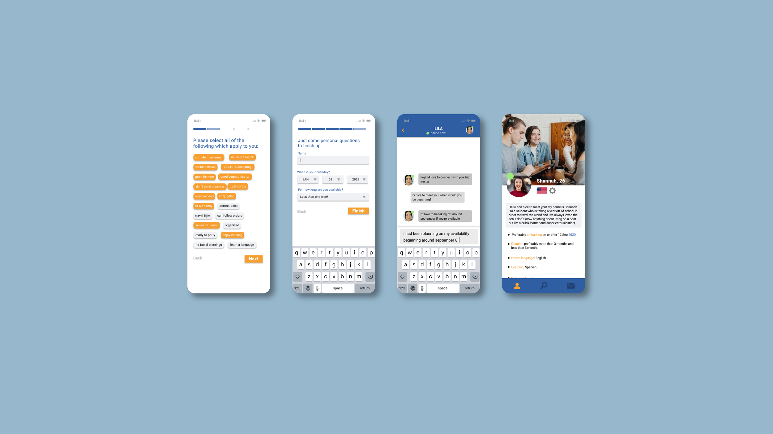
Early prototypes emphasized hierarchal organization, the appearance of a progress bar to indicate wherein the design process the user was operating, and a way to navigate back and forth through the process without losing progress.

Mid-fidelity Prototypes
After developing a mid-fidelity prototype that could be effectively manipulated by guerrilla testing groups, the feedback I received was that there was not enough reason for them to be utilizing the service in the first place - i.e. the service itself would not be viable to them if they could not be compensated financially. In creating a higher-fidelity prototype, I circled back and distributed a survey to a group of 20, 35.7% of whom prioritized compensation over any other lifestyle or personality compatibilities.
In addition, further design modifications include nodes where users can learn more information in the case that they are unfamiliar with specific terminology or references.


Design Interventions
To summarize, the design interventions that we are focusing on are as follows:
limiting questions being presented to the user at one time
progress bar to indicate where the user is in the onboarding process to provide feedback and encourage user retention
increased emphasis on elements important to user testing groups
hiding/showing information behind information buttons to reduce information overload and eye strain
updating UI elements for a more modern look and feel

